Colour Management
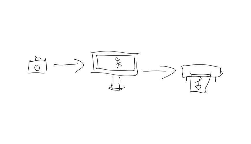
Camera to Screen to Print: A colour management story © James Troi
At our meeting last night we were joined by Michael from Kayell who took us through the tech-strong topic of Colour Management, Colour Profiles, and the Printing Process.
Not being a big self-printer I took a lot away from Michael's talk and may just think more about printing my own images now. We probably should see it as part of our process in creating our works in camera, to computer, and then to final output on print media.
Apologies, the notes are a little all over the shop; but hopefully you'll understand what I'm saying.
Commercial printing has become a one-size fits all process. Most tell you to set your image to sRGB JPEG at a certain PPI (Pixels Per Inch) and they'll print your images. And while this process will result in fine output, Michael tells us this does not mean optimal nor truely correct colour reproduction... the process may not allow for the full tonal range of your image to be reproduced and may result in loss of detail and fine colour shifts.
The process for ensuring our colour reproduction is correct depends on the steps we take throughout the process.
In camera
When making your image in camera, Michael highly recommends the use of the Datacolor SpyderCheckr24 ($89). Unlike an 18% Grey Card which is good for exposure and overall colour temperature, use of the Checkr24 allows you to calibrate your images against a wide range of colours and tones ensuring each colour is correct. The process is to take a shot of the Checkr24 at the start of your shoot and any time the light changes, you can then use the software from Datacolor to help correct your image in Photoshop.
On Screen
For truely accurate reproduction one should use a monitor like the Eizo ColorEdge CG2420 24 Inch LED Monitor. Unlike standard monitors, some of the Eizo range have the colour calibration built into the monitor and also allow you to calibrate for colours rather than just a standard white balance and brightness.
A note that colour calibration of our monitors using something like the Datacolor SpyderX Pro ($310) is only part of the process when printing. The use of a screen calibrator is good to set our screen's colour to a neutral colour temperature, with a brightness setting to suit your room's ambient light, making the whites appear white to our eyes. It doesn't, however, set the white point for our print media. Michael suggests that we need to do extra work to get this set right and for the most part it's about eyeballing the paper and the screen at the same time and making the screen match... with some caveats.
You should be observing your paper in the same light under which the final output will be displayed, or at daylight white balance, around 5000 Degrees Kelvin. To do the daylight test Michael showed us the Gti Sofv-1xi Desktop Soft Proofing Viewer ($5,900) though this is likely cost-prohibitive for most of us, he also said he'd send through details of some much cheaper set up options we can likely accommodate with a quick trip to Bunnings. Most galleries and competition viewing lights will be set to the daylight temperature, so if not stipulated as part of the entry criteria, it is recommended you use the daylight temperature as your basis. You should do this each time you change your print media.
Michael passed around examples of paper stock, highlighting that plastic-based papers are typically quite bluish in appearance while rag and other paper-based products are more neutral or warm. Without doing the paper to screen calibration we could be creating colour cast in our images without even realising it.
There was also the example of printing an arctic scene with a lot of whites and blues and placing it under an incandescent light with its warm hue will result in the blues in the image appearing greenish and the whites taking on a yellow appearance. If incandescent lighting was going to be the final choice to light the printed image, it should have been the light used to set the white balance of the paper stock to the screen so the cast could be accounted for, though again, daylight calibrated lights are typically the preferred lighting for prints.
Once you've set your whites for your output, you should create an ICC Colour Profile for your set up, this should be done each time you change paper stock type. In the past you used to also do this each time you changed your inks, but Michael says the process of ink manufacture these days ensures ink's pigment colours are precise and mitigate the need for this.
Printing
Kayell sell Epson printers, so this is the brand Michael spoke the most about. He highlighted the main difference between Epson and other brands is the way the ink is dispersed from the cartridge. Epson uses a vibration and pressure method allowing it to produce accurate dots of ink each time. Epson uses a process of dots small, medium, and large, with large being made by outputting a small and medium dot at the same time. Epson printers have a base of 180 dpi (dots per inch) and Michael highly recommends using multiples of 180 when sizing your images for print. Higher dpi/ppi doesn't mean more ink, it means smaller dots, and finer detail. An image printed at 360ppi will have more detail than one printed at 180ppi. If you send an image not at multiples of your printer's print value you will likely lose detail. ie a 200ppi image will have 20 extra dots of information that won't be output is it can't be accommodated by the 180 holes in the printhead. Printing at 2,880 (16 x 180) will result in ultra fine detail.
Ensure for fine art prints you are using the correct settings on your printer. Don't use bi-directional printing and don't use fast printing.
Epson's pigment-based inks will require time to dry when doing high detail colour, so peg it up and allow it to dry completely before mounting for presentation.
When printing black and white use the correct inks, Michael recommends a printer that has multiple blacks such as the Epson Surecolor SC-P800 A2 Desktop Printer ($1,695) which holds three (of four) blacks: Photo Black or Matte Black, Light Black, Light Light Black, plus Cyan, Magenta, Yellow, Light Cyan, and Light Magenta. When printing a black and white image the Epson has the option for Advanced Black & White which will turn off the cyan and magenta when printing, and use the others to make a more pure black and white image. Using the darker cyan and magenta inks when printing black and white can result in an unwanted colourcast.
Conclusion
Again, apologies for the scattered notes, there was likely a bunch more information I missed while furiously typing as fast as I could. If you would like any more information about the printing process and the solutions Kayell can provide check out the Kayell website or give them a call on 03 8412 2800.
We'll update this article when we receive follow up from Michael about some items he mentioned. If you think I missed anything, or got something woefully wrong, shoot me an email to webmaster@williamstowncameraclub.com.au and I'll look into it.